A new UI: left tree, flat tables, and Kaisen as a chat
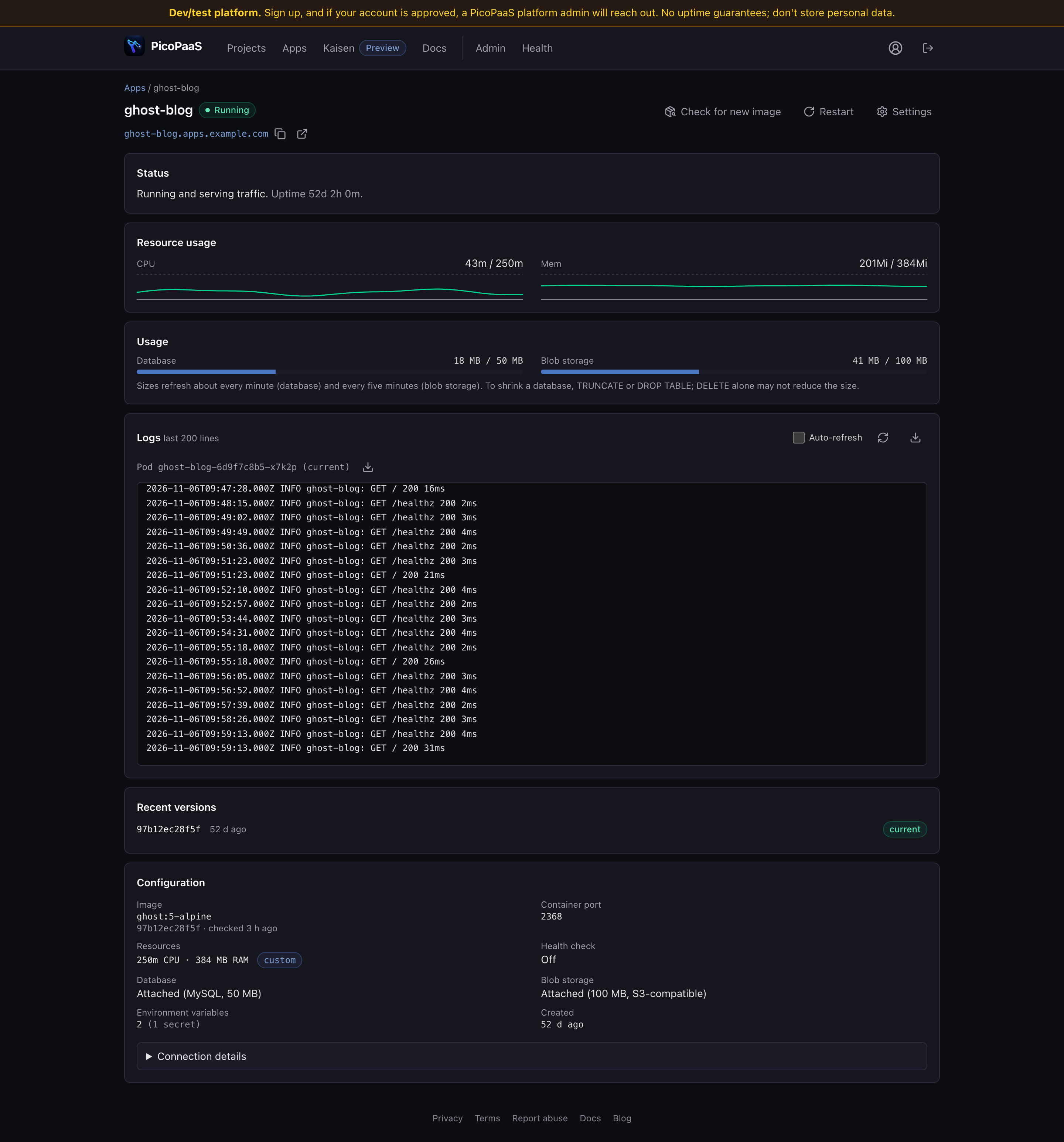
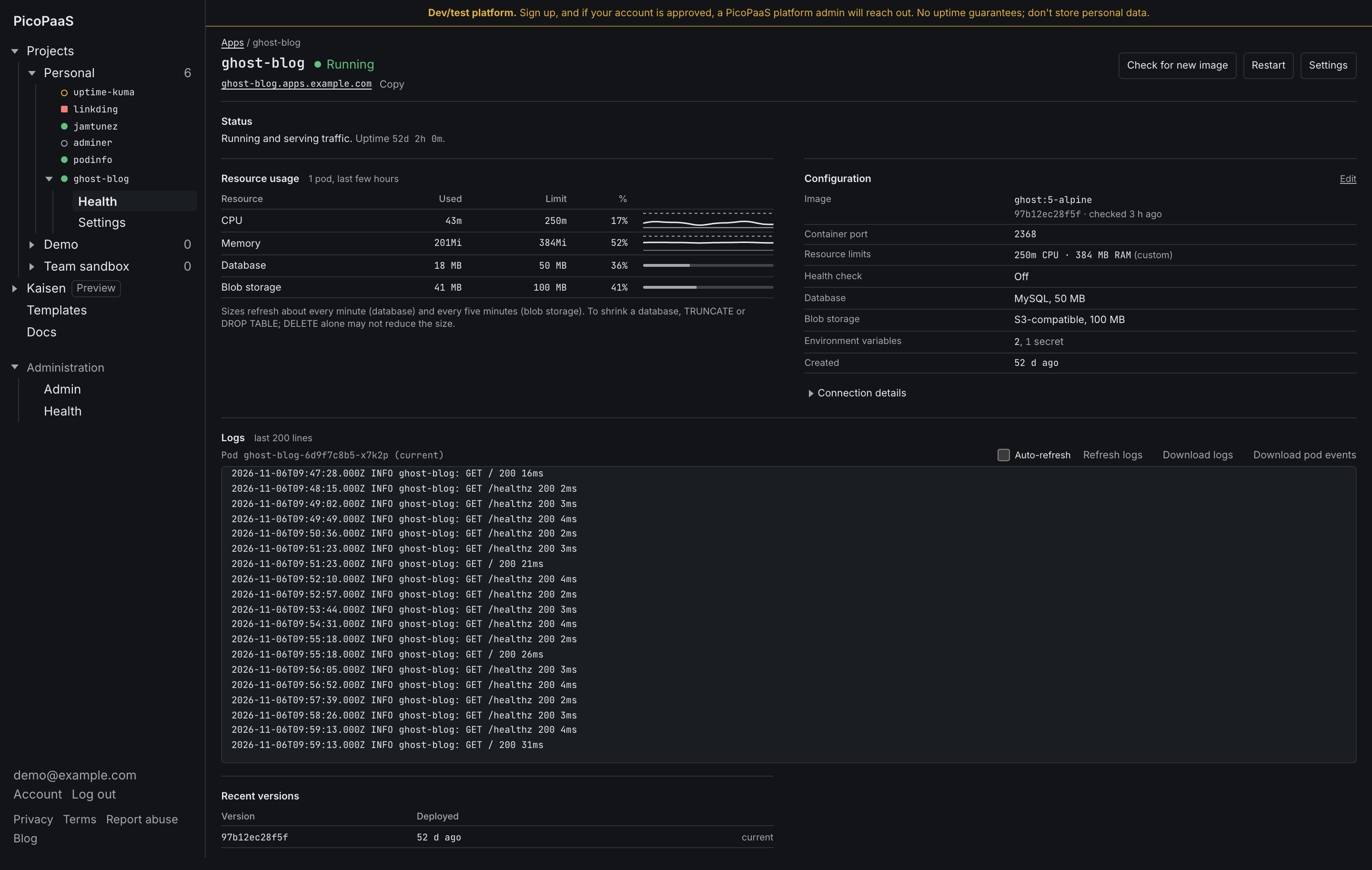
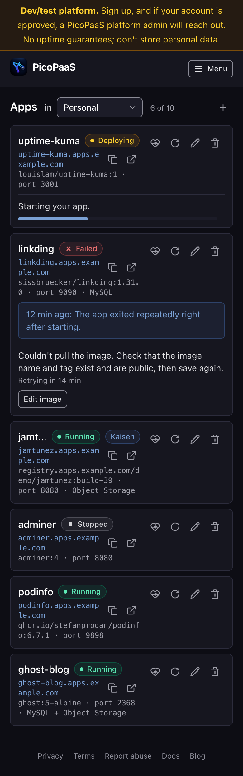
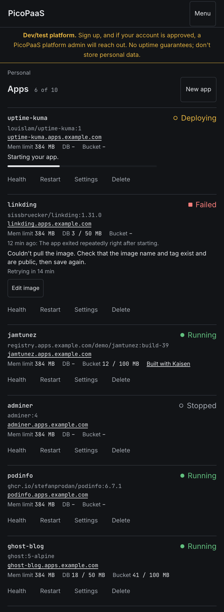
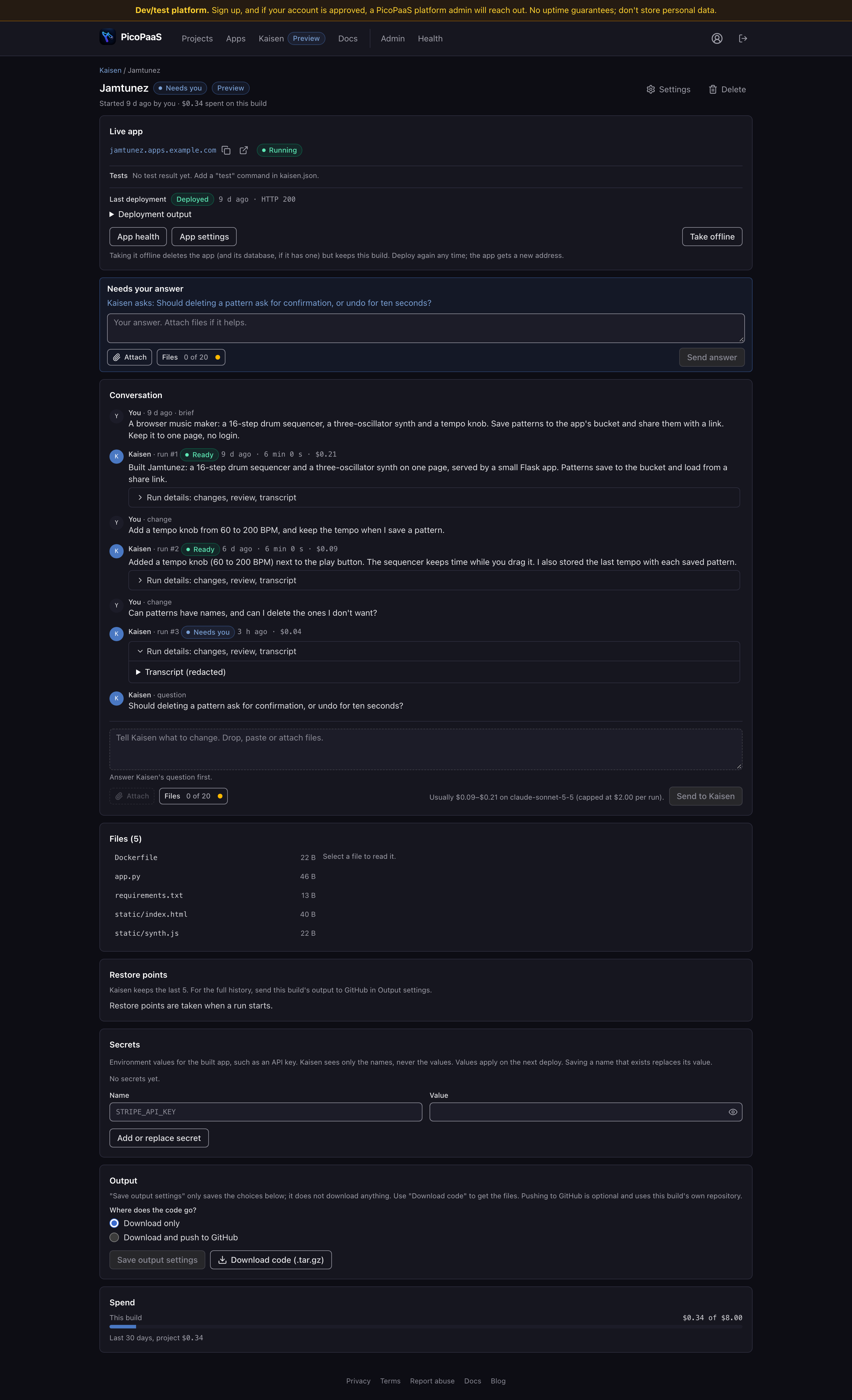
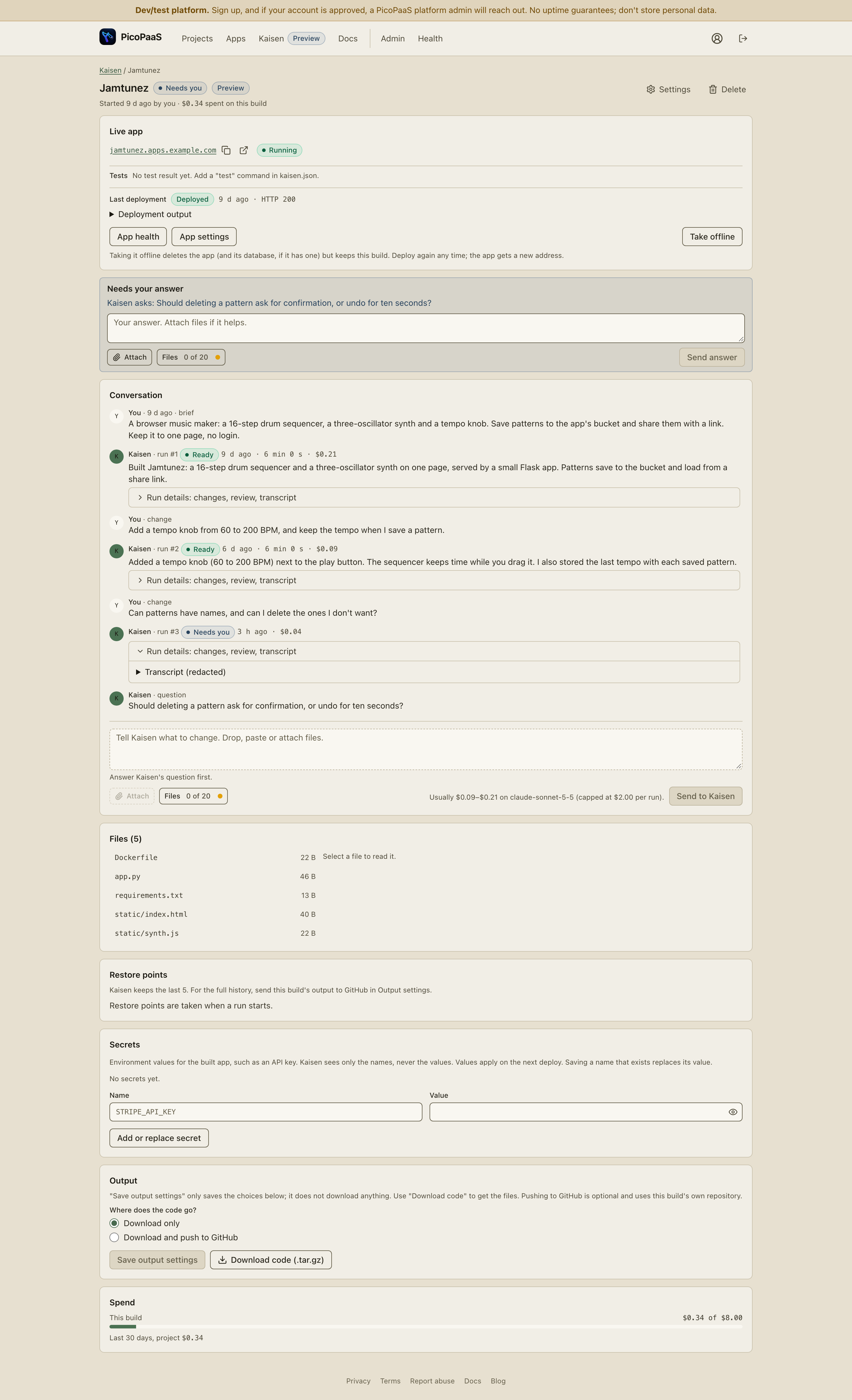
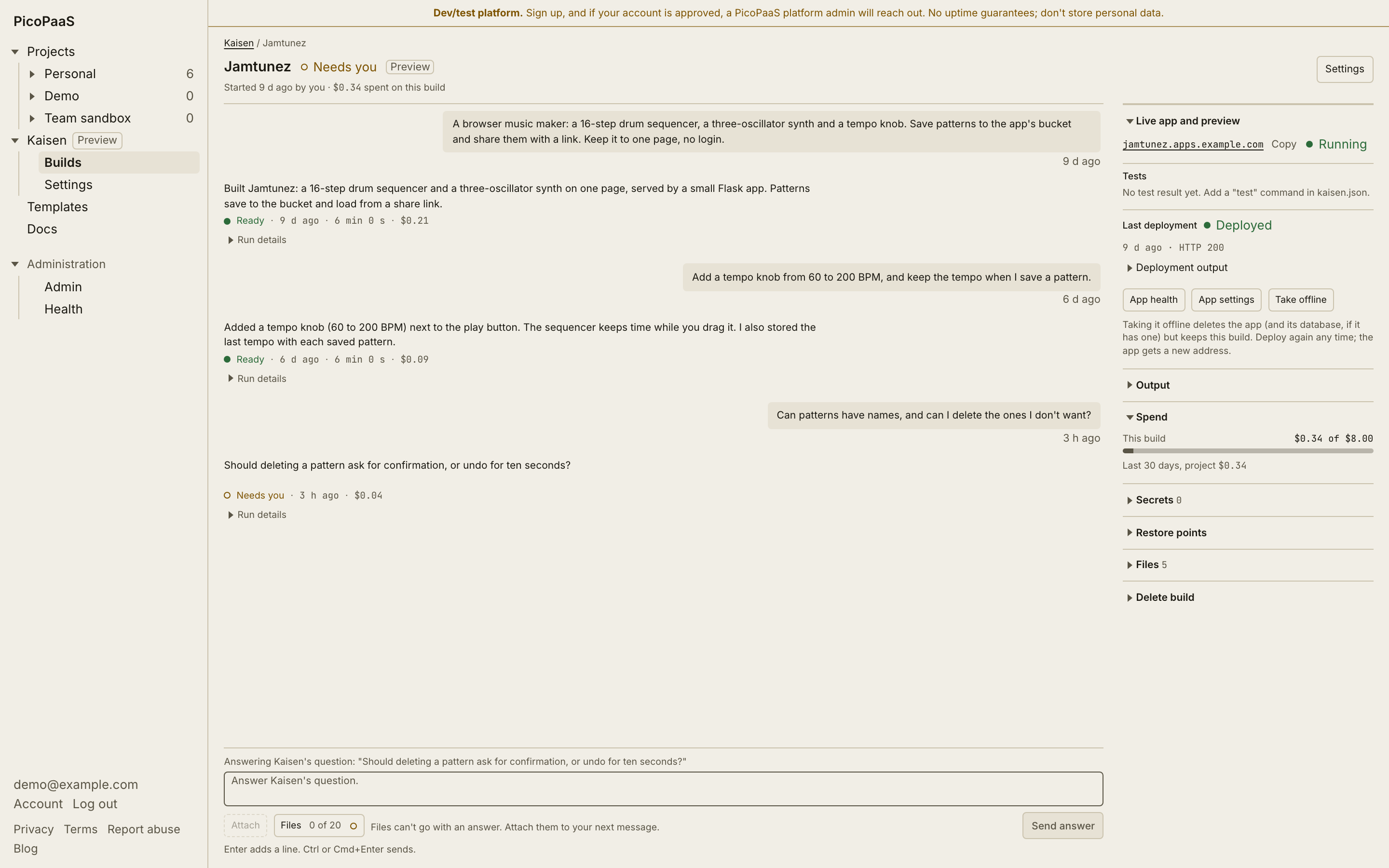
We redesigned the whole PicoPaaS UI as a tool for engineers: a left tree, flat tables, text actions, light and dark themes, a phone layout, and Kaisen's build page as a chat. Before and after screenshots use demo data.
We just shipped a redesign of the whole PicoPaaS UI. The screenshots below use made-up demo data, not a real account.
Why
Chas wanted it to look like an engineer built a tool for other engineers, not a dashboard selling a SaaS product. The rules we worked to:
- No gradients.
- Radii of 4 to 6px, not 12 to 16.
- No decorative icons.
- Monospace only for technical values, identifiers and resource quantities; normal sans-serif for everything else.
- Tables, dividers and aligned columns over nested cards.
- Color communicates state, never decoration.
- High information density.
What changed
- A collapsible left tree (projects, then apps, then Health and Settings) replaces the top nav and the project picker. Each app's status shows in the tree.
- Tables instead of card lists, and pages use the full width.
- All actions are text.
- State has a text label plus a dot whose shape differs by state, so color is never the only signal.
- New light and dark tokens.
- The phone layout has its own rows and a full-screen Menu.
- The landing and privacy pages match.
Apps
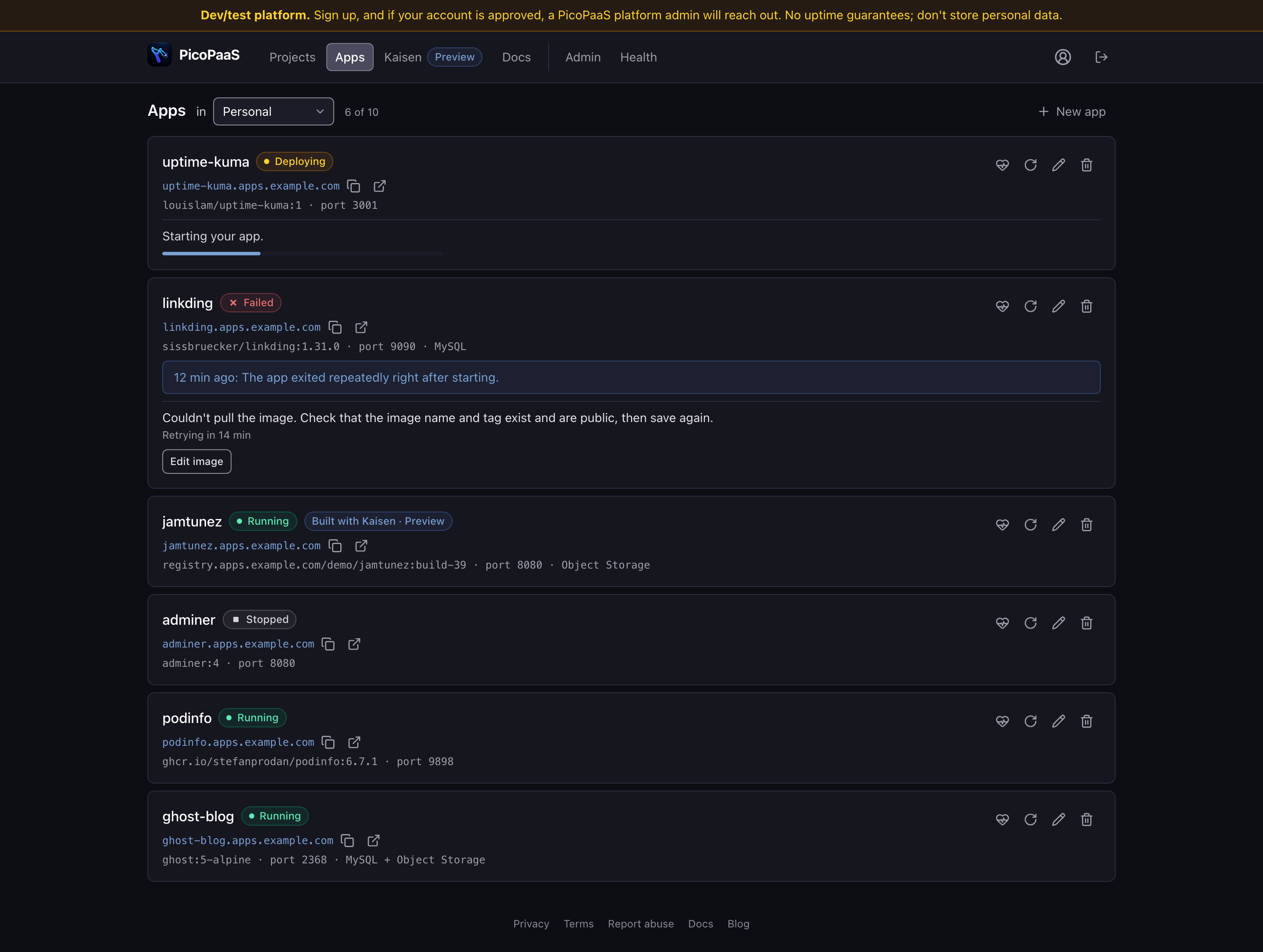
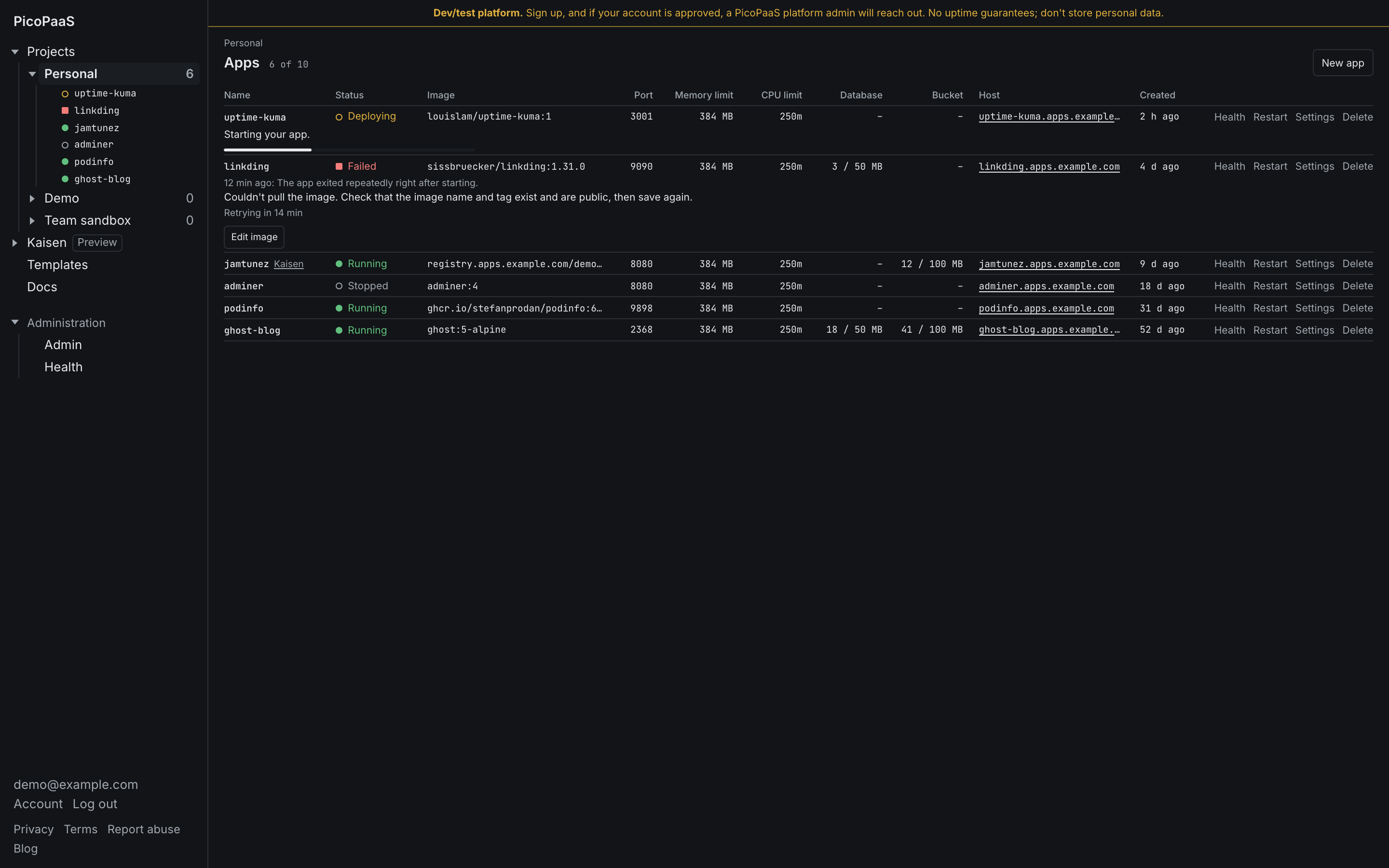
App health
Apps on a phone
Kaisen's build page is now a chat
Your messages are on the right, Kaisen's on the left, no avatars. The composer is pinned to the bottom, and the view stays at the newest message unless you scroll up. Progress and questions appear inline, and you answer a question from the composer. Status, spend, secrets, files and restore points moved to a right rail. Enter deliberately still adds a new line; Ctrl/Cmd+Enter sends.
Kaisen build page, dark
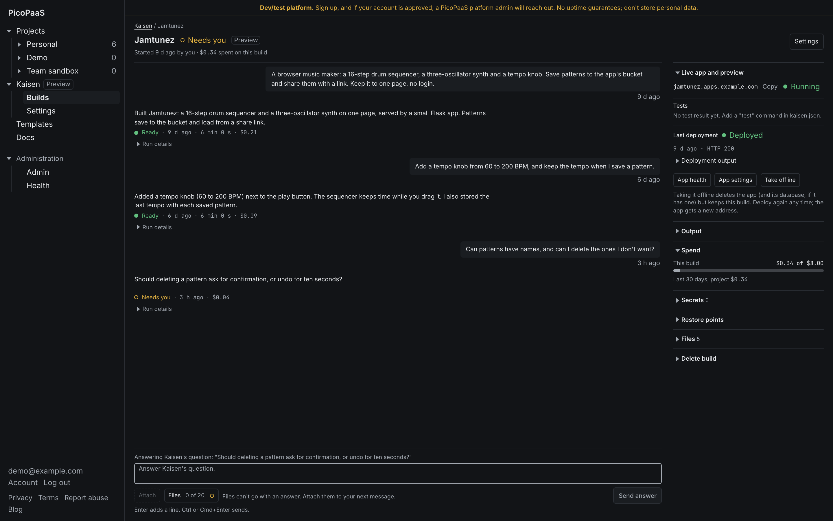
Kaisen build page, light
Trade-offs
- The Apps table shows limits rather than live usage for memory and CPU, because live numbers would need another request per app.
- Wide admin tables scroll inside their own box on phones rather than stacking.
- You can't attach files when answering a Kaisen question.
Testing
The end-to-end tests went from 2 to 13, covering the tree, the phone menu, the Kaisen composer and chat scrolling. A security review of the frontend diff found two low-severity issues, both fixed.
Chas is doing heavy hands-on testing next, so expect more tweaks to follow.