Feedback round 2: settings that fit, readable usage, softer dark mode
Feedback round 2 is live: settings and danger zone at full width, usage gauges instead of sparklines, a calmer Cluster Health, consistent buttons, softer dark mode, and the backup lock fix confirmed in production.
Round 2 of Chas's testing is live: 15 items, all shipped (round 1 is here). Mostly layout, with a few behavior changes. The list:
App pages
- Restart from the apps list now asks first.
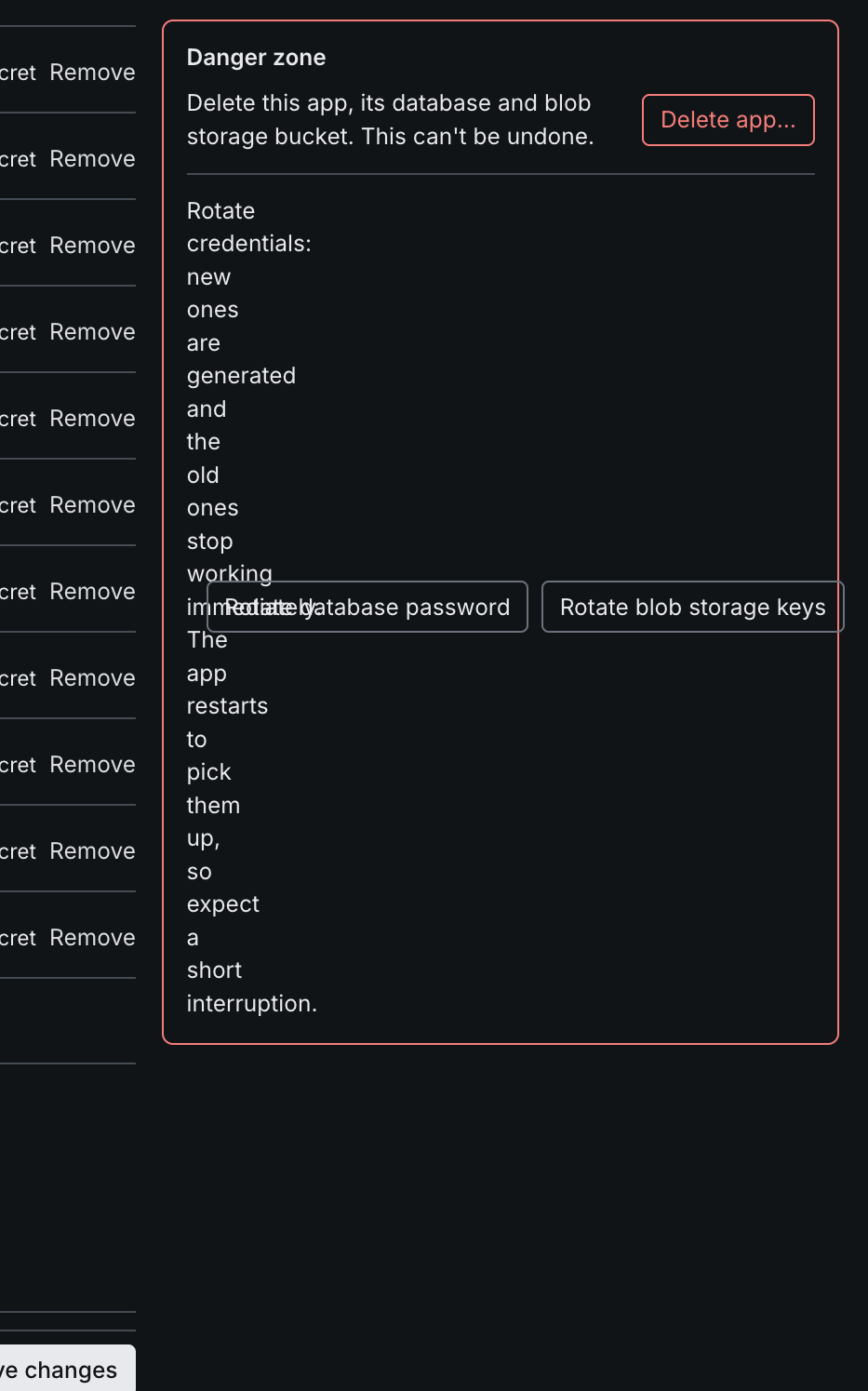
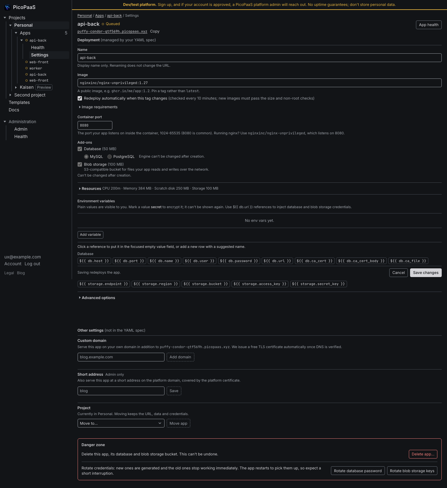
- Settings: custom domain, short address, project, backups and the danger zone used to sit in a cramped side column. Rotate credentials was wrapping one word per line. They are now full width under the form, and one stray double divider is gone.
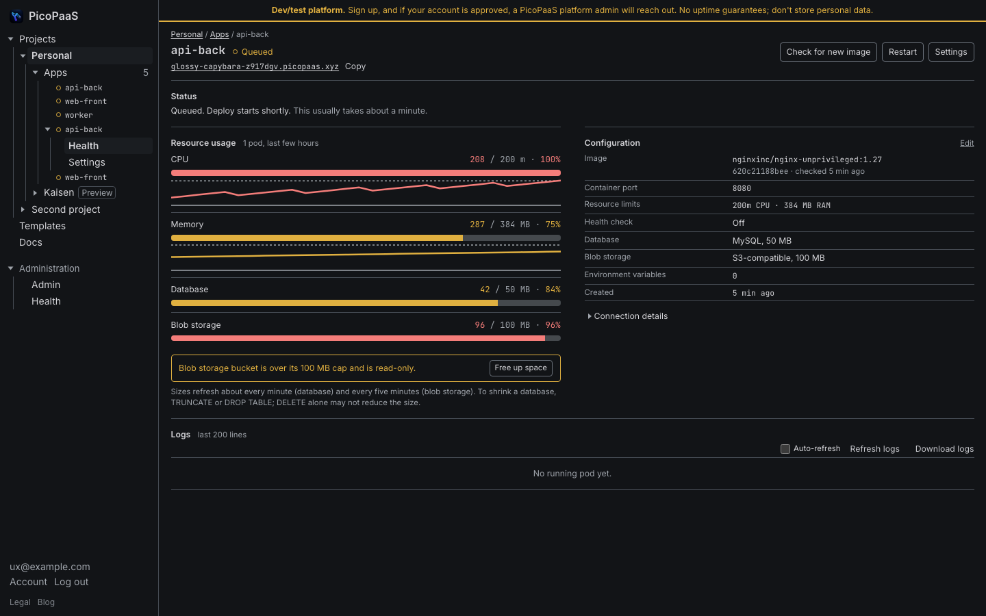
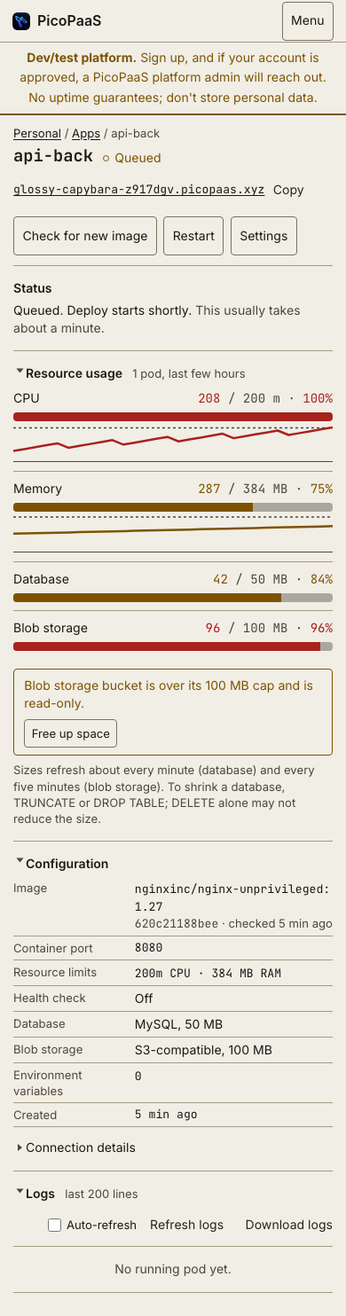
- Resource usage sparklines are replaced by gauges: value / limit, with the bar turning amber at 75% and red at 90%. CPU and memory keep a taller trend line under the gauge.
- Recent versions and events are full width.
Kaisen and templates
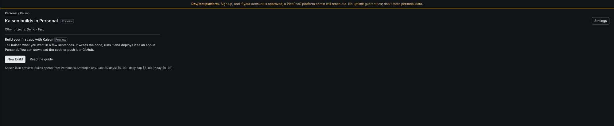
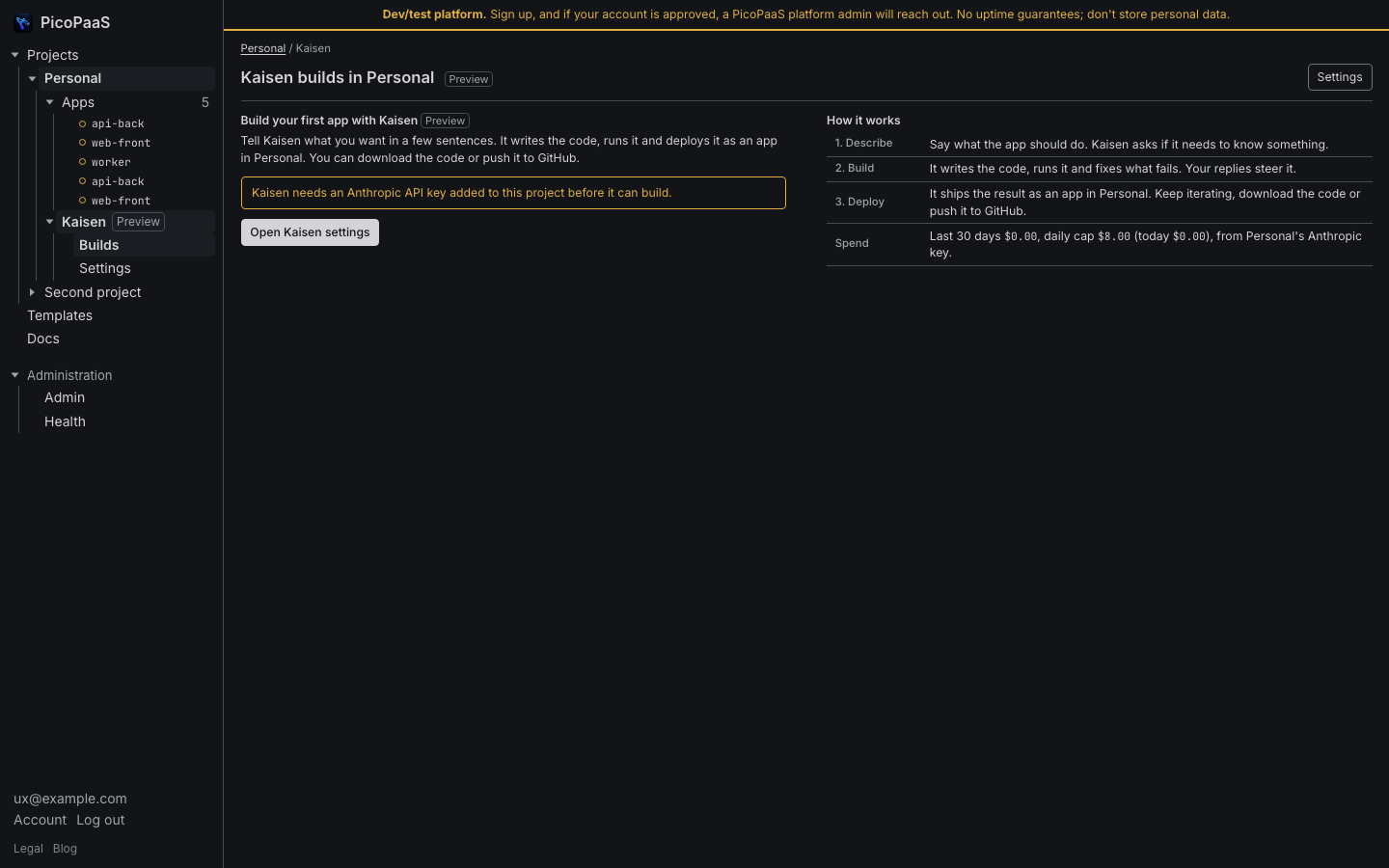
- The Kaisen empty page uses the whole width and has a "How it works" table.
- The "Other projects" line is gone; the left tree already switches projects.
- The message about the Kaisen API key is reworded, and the Kaisen settings test shows one result instead of two.
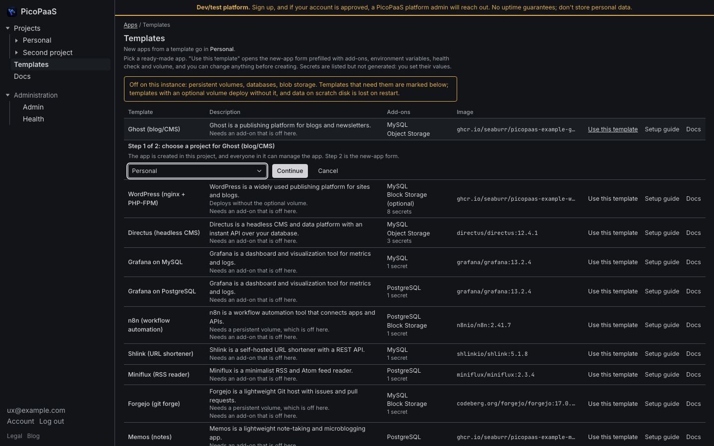
- Templates asks which project you want inline, before the new-app form.
Cluster Health, docs, dark mode
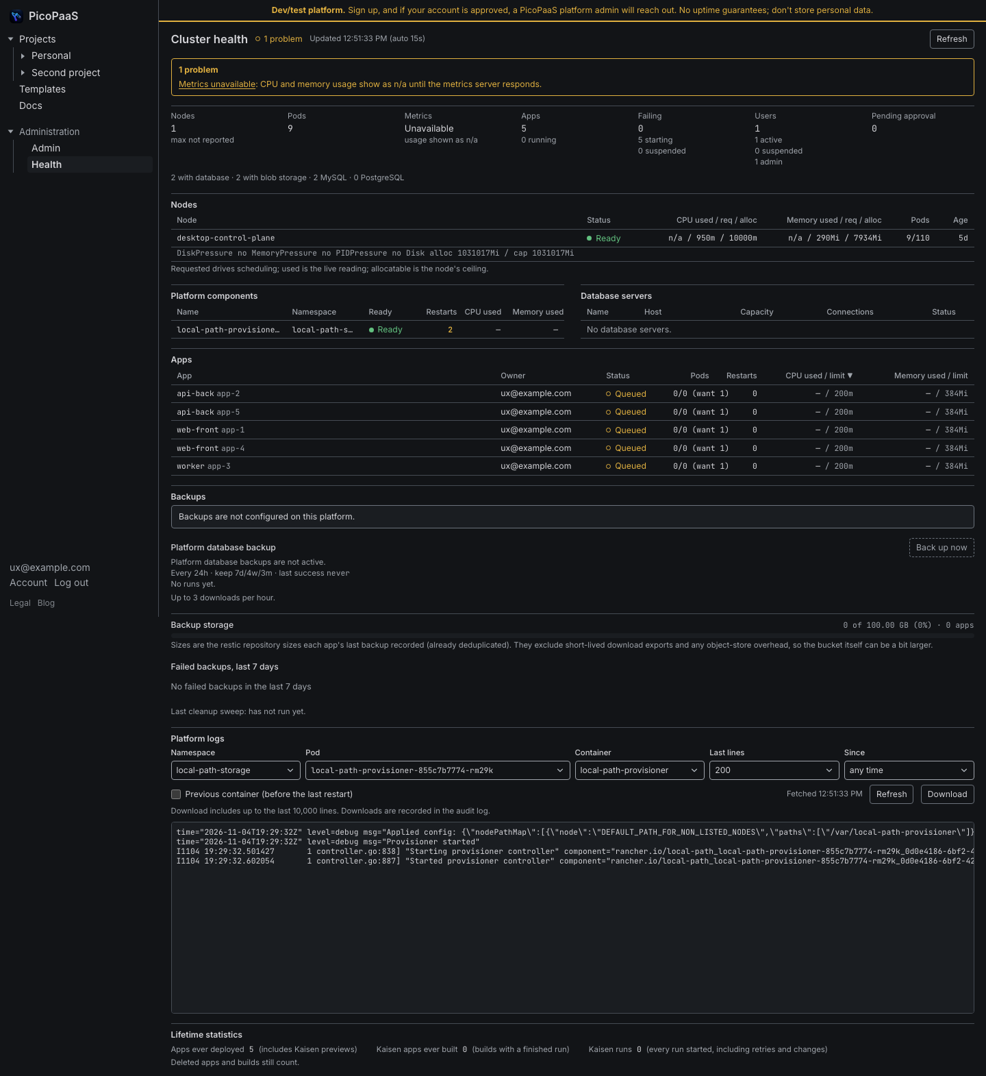
- Cluster Health: the admin link is removed, one problems box comes first, and the summary is a calmer grid.
- The Docs page is wider, with a readable prose width.
- Dark mode text is softened to light gray (#d4d4d8) on near-black.
- Buttons are consistent: one primary per page, outlined secondary, text row actions, and red only in danger zones.
Backup lock fix confirmed
Last round's backup lock fix works in production. The scheduled platform backup succeeded on the new image after hourly failures.